
1. Emphasis
Say you’re creating a poster for a concert. You should ask yourself: what is the first piece of information my audience needs to know? Is it the band? Or the concert venue? What about the day and the cost of attending?
Make a mental outline. Let your brain organize the information and then lay out your design in a way that communicates that order. If the band’s name is the most essential information, place it in the center or make it the biggest element on the poster.
Or you could put it in the strongest, boldest type. Learn about color theory and use strong color combinations to make the band name pop.
Like writing without an outline or building without a blueprint, if you start your composition without a clear idea of what you’re trying to communicate, your design will not succeed.
2. Balance and alignment
Never forget that every element you place on a page has a weight. The weight can come from color, size, or texture. Just like you wouldn’t put all your furniture in one corner of a room, you can’t crowd all your heavy elements in one area of your composition. Without balance, your audience will feel as if their eye is sliding off the page.
Symmetrical design creates balance through equally weighted elements aligned on either side of a center line. On the other hand, asymmetrical design uses opposite weights (like contrasting one large element with several smaller elements) to create a composition that is not even, but still has equilibrium.
Symmetrical designs are always pleasing, if not occasionally boring. Asymmetrical designs are bolder and can bring real visual interest and movement (more on that later!) to your composition.
Lorem ipsum dolor sit amet, consectetur adipiscing elit. Nec praesent tincidunt est mauris. Magna sagittis, risus id pharetra magna mauris est nunc, cursus. Porttitor arcu mattis quis integer auctor id nibh. Sit scelerisque justo, elit velit pellentesque. Enim, nisl molestie nam lobortis ac vel diam congue. In consequat sem euismod amet aliquam, sit sit. Adipiscing viverra eget.
• Lorem ipsum dolor sit amet, consectetur.
• Turpis sollicitudin nisi aliquam idaste.
• Placerat lacinia rutrum proin adipiscing volutpat.
Lorem ipsum dolor sit amet, consectetur adipiscing elit. Aliquam ut suspendisse imperdiet cons ectetur. Enim, sed proin sed volutpat non. Purus sem et est ullamcorper dolor, sed ut id. Sene ctus ultrices praesent habitant sed enim, libero arcu vitae blandit dolor diam adipiscing diam.
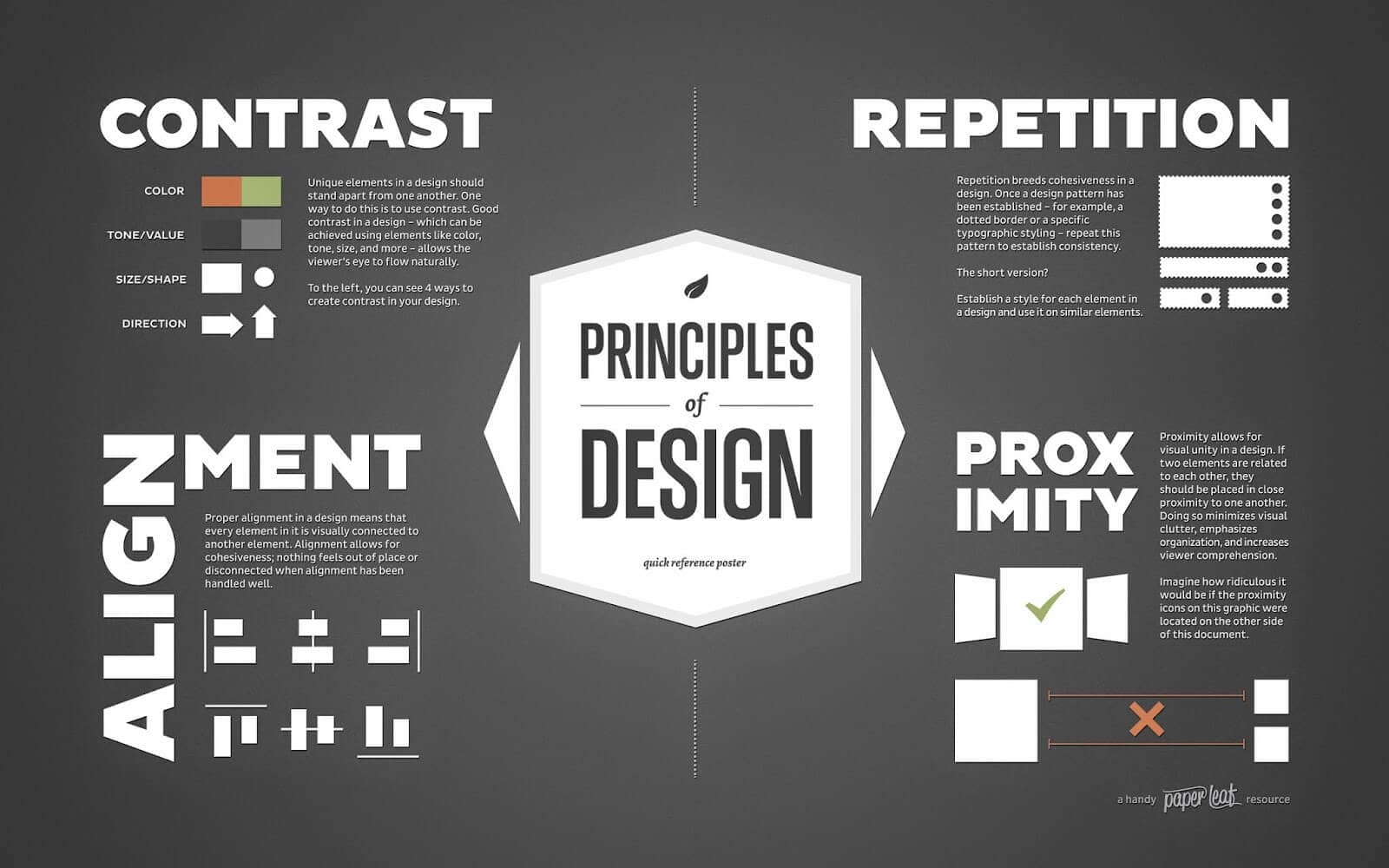
3. Contrast
Contrast is what people mean when they say a design “pops.” It comes away from the page and sticks in your memory. Contrast creates space and difference between elements in your design. Your background needs to be significantly different from the color of your elements so they work harmoniously together and are readable.
If you plan to work with type, understanding contrast is incredibly essential because it means the weight and size of your type are balanced. How will your audience know what is most important if everything is in bold?
As you seek out examples of really strong, effective design, you’ll notice most designs only feature one or two typefaces. That’s because contrast can be effectively achieved with two strong fonts (or even one strong typeface in different weights). As you add fonts, you dilute and confuse the purpose of your design.
4. Repetition
If you limit yourself to two strong typefaces or three strong colors, you’ll soon find you’ll have to repeat some things. That’s ok! It’s often said that repetition unifies and strengthens a design. If only one thing on your band poster is in blue italic sans-serif, it can read like an error. If three things are in blue italic sans-serif, you’ve created a motif and are back in control of your design.
Repetition can be important beyond one printed product. Current packaging design is heavily embracing beautiful illustrated patterns. Anyone thinking about a startup knows one of the first things you need is a strong logo to feature on your website, business cards, social media and more. Brand identity? Another term for repetition.
5. Proportion
Proportion is the visual size and weight of elements in a composition and how they relate to each other. It often helps to approach your design in sections, instead of as a whole.
Grouping related items can give them importance at a smaller size—think of a box at the bottom of your poster for ticket information or a sidebar on a website for a search bar. Proportion can be achieved only if all elements of your design are well-sized and thoughtfully placed. Once you master alignment, balance, and contrast, proportion should emerge organically.
6. Movement
Going back to our concert poster. If you decided the band was the most important piece of information on the page and the venue was the second, how would you communicate that with your audience?
Movement is controlling the elements in a composition so that the eye is led to move from one to the next and the information is properly communicated to your audience. Movement creates the story or the narrative of your work: a band is playing, it’s at this location, it’s at this time, here’s how you get tickets. The elements above—especially balance, alignment, and contrast—will work towards that goal, but without proper movement, your design will be DOA.
If you look at your design and feel your eye get “stuck” anywhere on it—an element is too big, too bold, slightly off-center, not a complimentary color—go back and adjust until everything is in harmony.
7. White space
All of the other elements deal with what you add to your design. White space (or negative space) is the only one that specifically deals with what you don’t add. White space is exactly that—the empty page around the elements in your composition. For beginning designers it can be a perilous zone. Often simply giving a composition more room to breathe can upgrade it from mediocre to successful.
White space isn’t sitting there doing nothing—it’s creating hierarchy and organization. Our brains naturally associate ample white space around an element with importance and luxury. It’s telling our eyes that objects in one region are grouped separately from objects elsewhere.
Even more exciting, it can communicate an entirely different image or idea from your main design that will reward your audience for engaging with it. The logo above uses active negative space to communicate multiple ideas in one fun, creative design.