
What is Mobile-First Theme?
When it comes to web design, the mobile-first approach is all the rage right now.
But what is the mobile-first theme, and why should you consider using it for your website? Mobile first theme means designing for the smallest screens first and then working your way up to larger screens.
This approach takes into account the fact that more and more people are accessing the web through their smartphones and tablets, and these devices have different requirements than desktop computers. By focusing on the needs of mobile users first, you can create a website that is both user-friendly and visually appealing.
Why Should You Consider Mobile-First Themes?
When you are designing a website, you should always consider your target audience. However, when designing for mobile devices, you should give special consideration to your mobile users.
Mobile first theme is an approach that takes this into account and focuses on designing for the mobile screen first. This means that the website will be responsive to smaller devices, and the desktop version will be secondary.
There are several advantages to using a mobile-first approach. First, it ensures that all users, regardless of device, will have a good experience on your website. Second, it makes the development process simpler and more efficient. And third, it is more cost-effective because you can design a single website that will work on all devices.
Optimizing Mobile-First Themes for Different Devices
As you start to design your website, it’s important to think about how you can optimize it for different devices. Different devices require different layouts and designs, and you want to make sure that your website looks great on all of them.
That’s where the mobile-first approach comes in. By starting with the layout for mobile devices, you can make sure that your website is responsive and looks great on all devices. From there, you can add additional designs for larger screens and browsers.
Let's make it for you too!
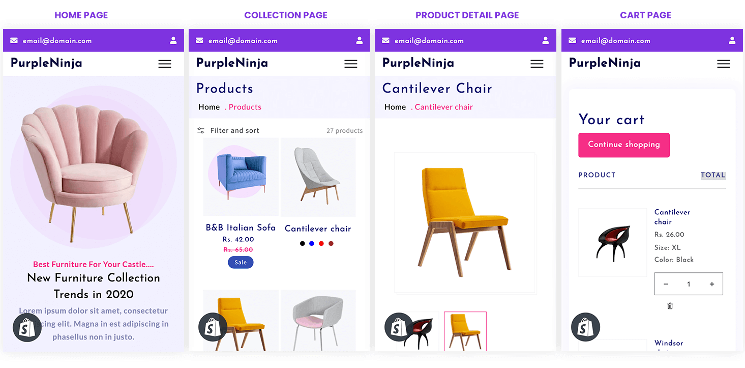
Now that you understand mobile-first, it’s time to start planning your own website with the mobile-first theme launched by Webninjaz known as ‘Purple Ninja’ for your consistent user experience across all devices.